The goal
Prove the promise before asking anyone to believe it.
A studio that promises a finished website in seven days can’t get away with a slow, half-finished website of its own. So we gave ourselves the brief we give every client, and a harder deadline than theirs: 48 hours from brief to live.
Who it’s for. Owners of service businesses, like accountants, clinics, law firms and consultants, whose website no longer reflects how good their business is. Most of them have been through a website project before, and most of them remember it as months of waiting.
What it has to do. Answer their questions in the order they ask them, show real work they can click through, and make booking a build week the obvious next step, without anyone needing to get on a call.
How we’d know it worked. Every page scores 95 or more on Google’s Lighthouse test on a phone. Every page reads comfortably on a small screen. And every screen asks the reader to think about one thing at a time.
The brand
A mark built out of motion, found by drawing more than thirty.
The brand had to say “fast” before anyone read a word. We didn’t start with the answer. We drew every idea we could think of in the same square geometry and the same three colours, so we could judge them fairly, and then cut them down.
First, eight marks that count to seven. A numeral tile, seven rising bars, a week ring, seven squares out of nine, a crossed continental seven, an S7 monogram, a fraction and a framed seven. Each one was drawn large, at 24 pixels and next to the wordmark, because a mark that only works big isn’t a mark.
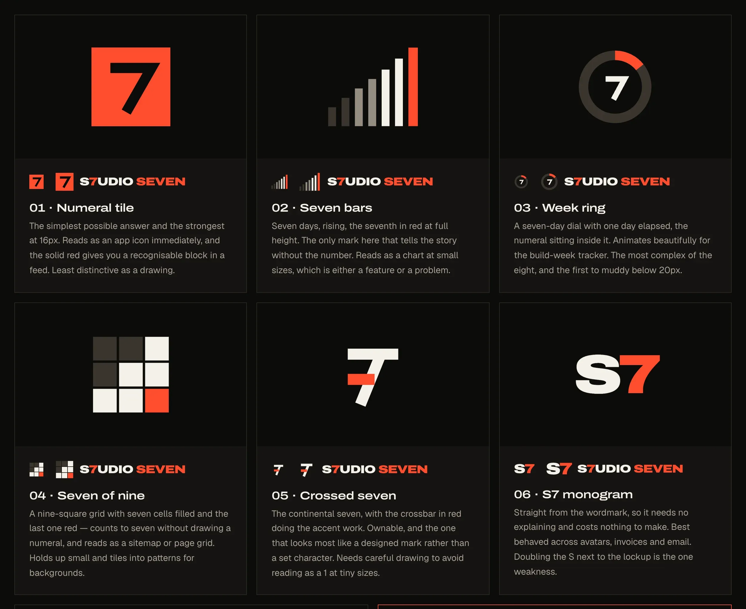
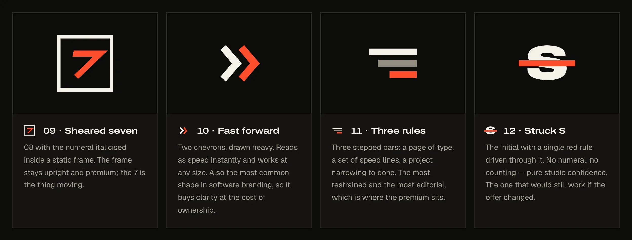
Then four that say fast and premium instead. A sheared seven in a frame, a chevron pair, three stepped rules and a struck S. These were about positioning more than the number.
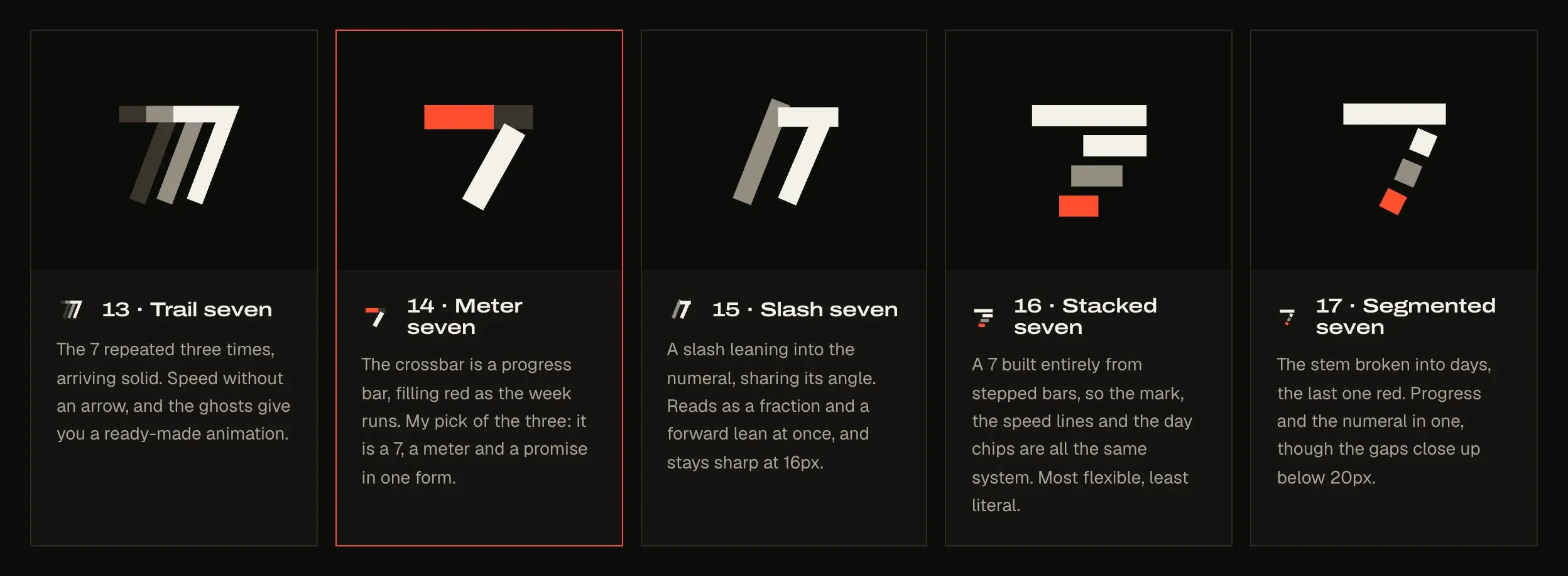
Then speed built into the seven itself. This is where it clicked. We took the ideas that felt most like us and drew them into the numeral: a trail, a meter, a slash, stacked bars and a segmented stem.
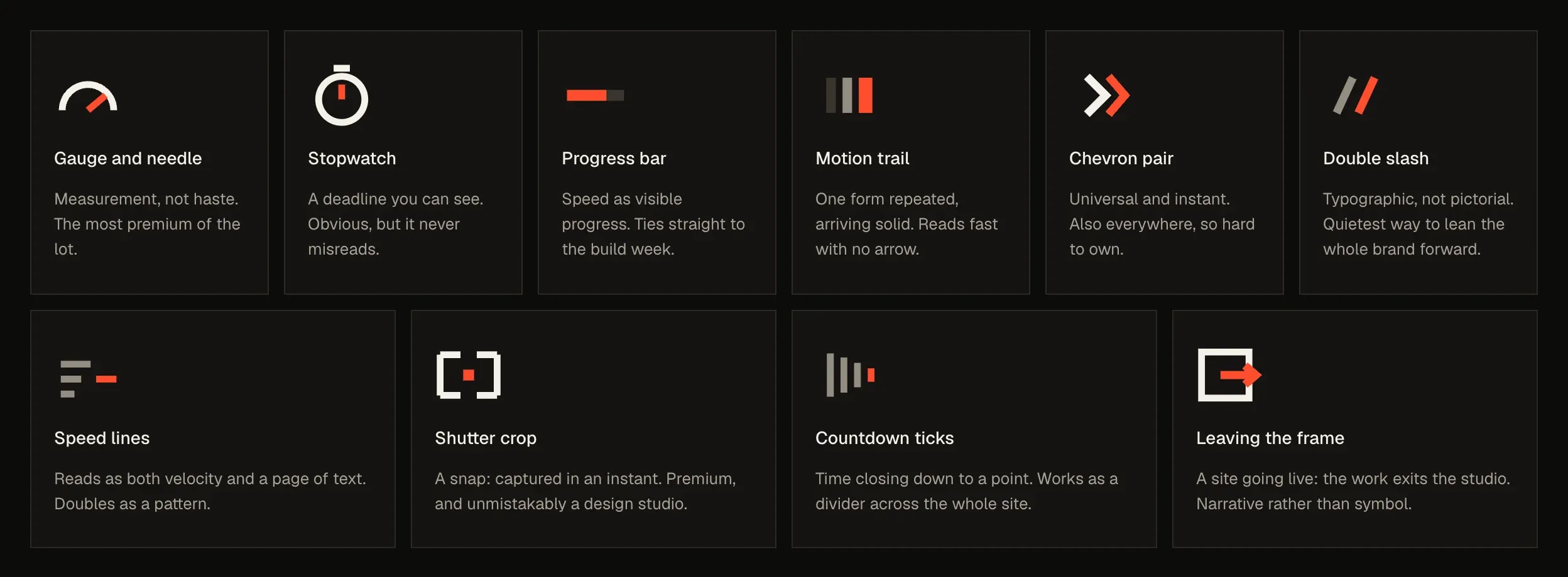
Checked against everything else that reads as fast. Before committing, we drew ten other speed symbols in the same style, from a gauge to a progress bar to a countdown, to make sure we weren’t missing something better. We also wrote down what to avoid: lightning bolts and rockets read cheap, and hourglasses say waiting, which is the opposite of the promise.

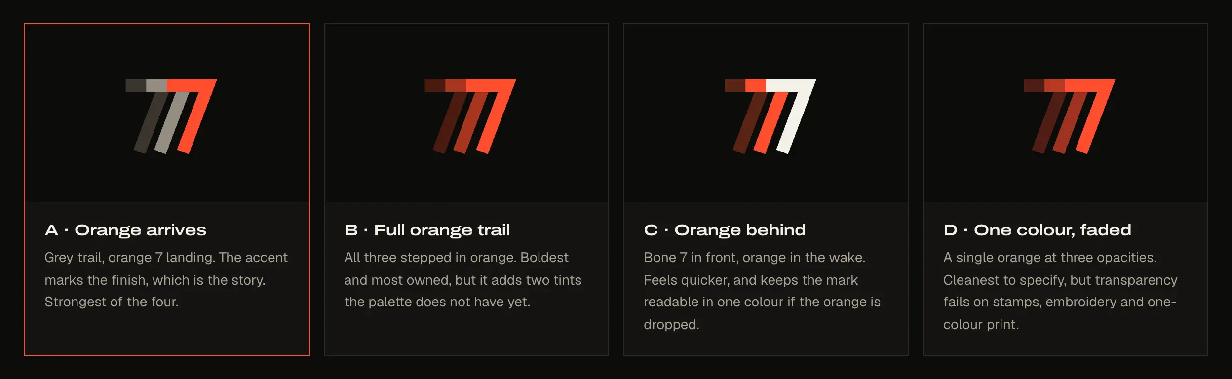
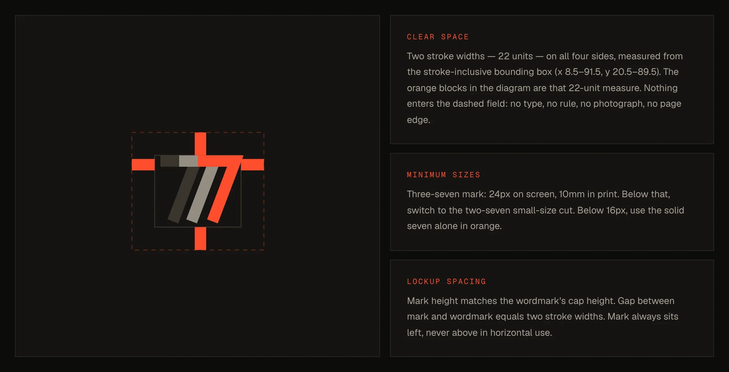
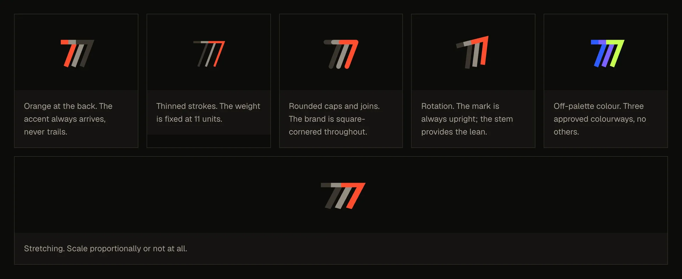
Where we landed: the Trail seven. Three sevens drawn in one stroke, a solid one in front and two fading ghosts behind it, the way a fast object leaves a trail in a photo. It’s the number of days in the promise, and it’s already moving. We tried four ways for the orange to carry the trail, and chose the one where the orange seven arrives last, because the accent should mark the finish.
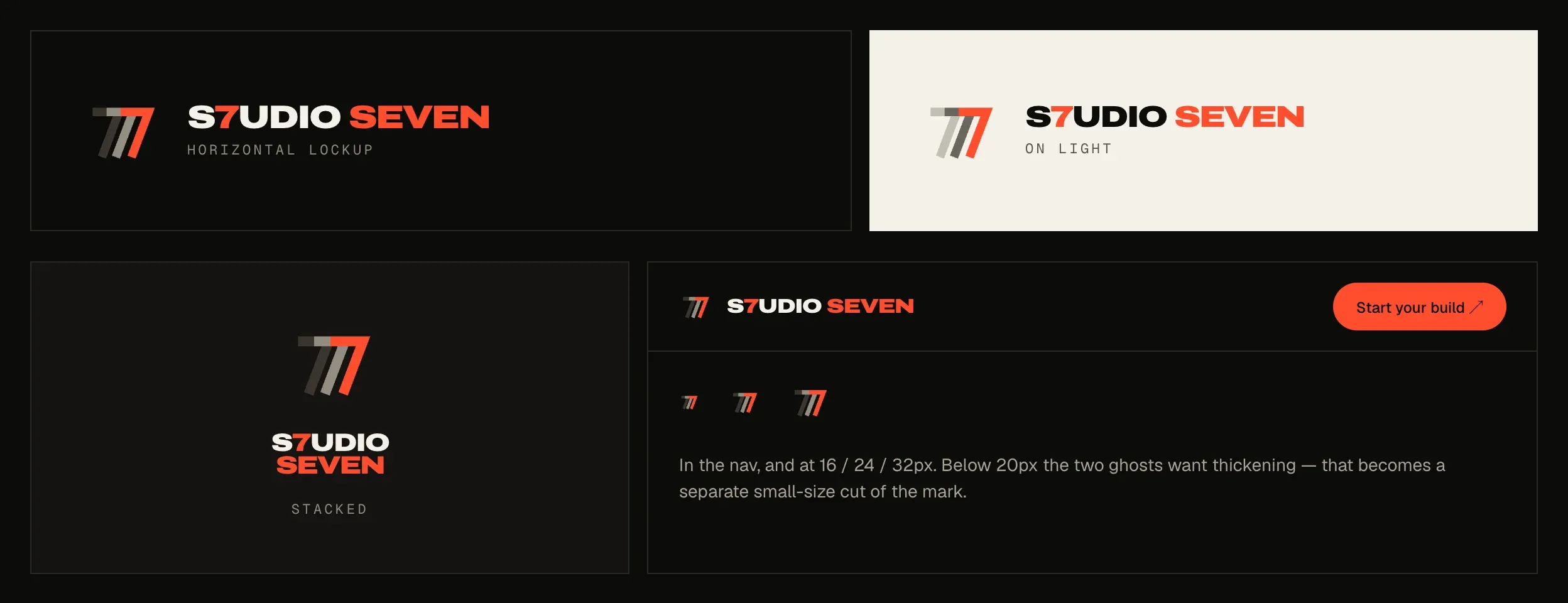
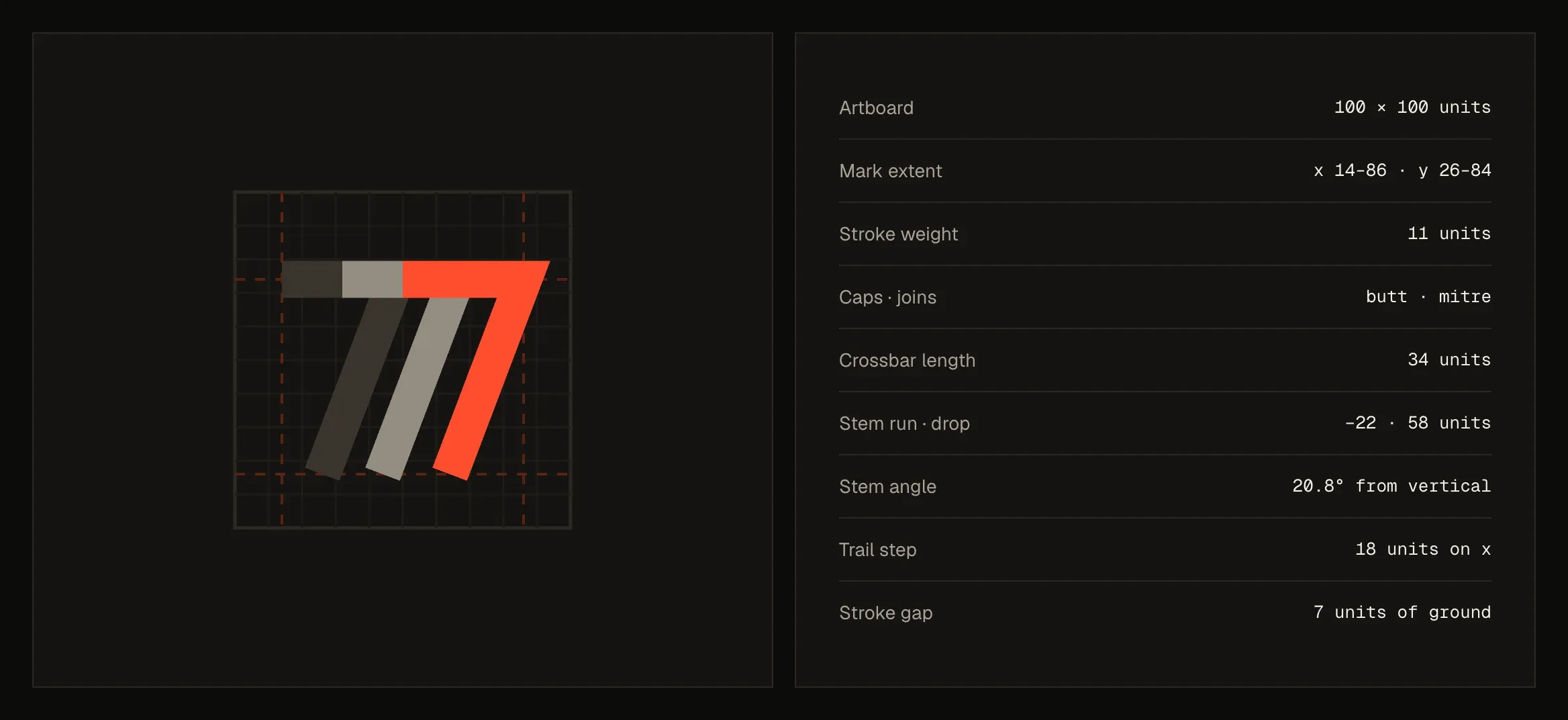
Then we wrote the rules down. A mark is only finished when someone else could redraw it exactly. The specification sets the construction to the unit, the approved colourways, the clear space and minimum sizes, and the ways it must never be used.
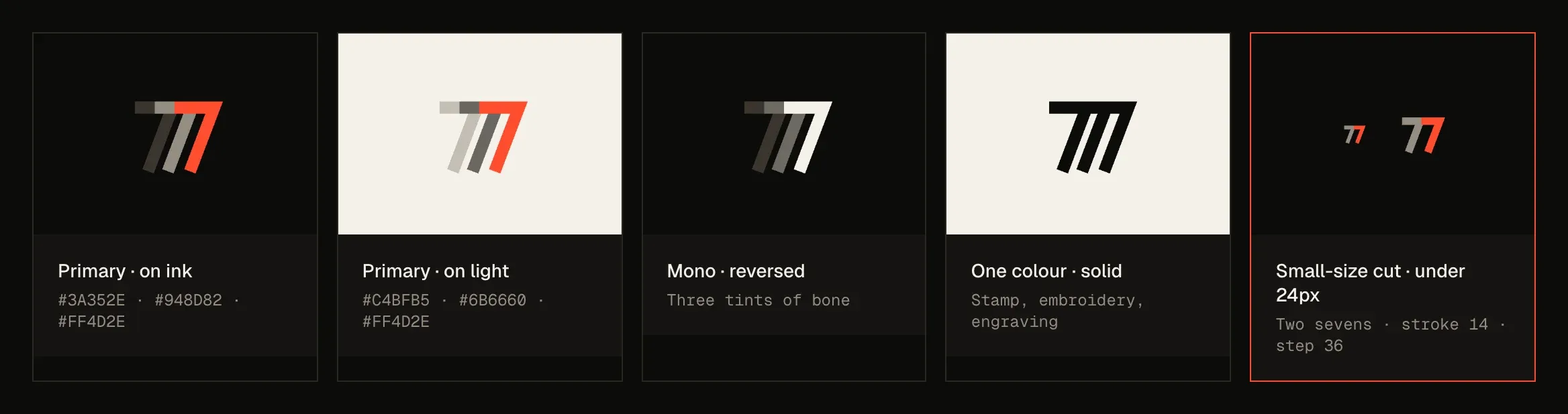
Colour, used sparingly. Ink and bone are the grounds, silver is the second surface, and signal orange is the one loud colour, used for about eight per cent of any screen. We hold that ratio everywhere, so the orange always means something: the button, the accent phrase, the thing you should look at.
One signal block per screen. It’s a rule, not a feeling. When an orange panel fills the view, the orange “Start your build” button in the navigation quietly turns bone, so there are never two orange blocks fighting for attention.
Type with weight. Archivo Expanded carries the headlines and every number, because a price or a date should look as certain as it is. Geist is the reading type, and Geist Mono the small labels. Every corner is square, because rounded corners read as friendly software and we wanted this to read as precise.
The system
Every card, button and screen designed before it was built.
A logo on its own isn’t a brand. It becomes one when every place your business shows up looks like it came from the same hand. So before we built a page, we designed the pieces the site is made of.
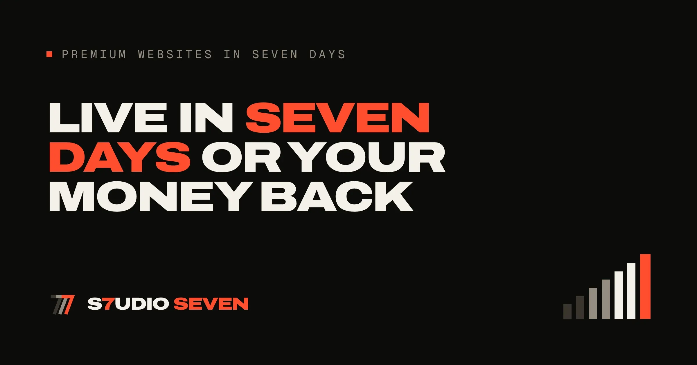
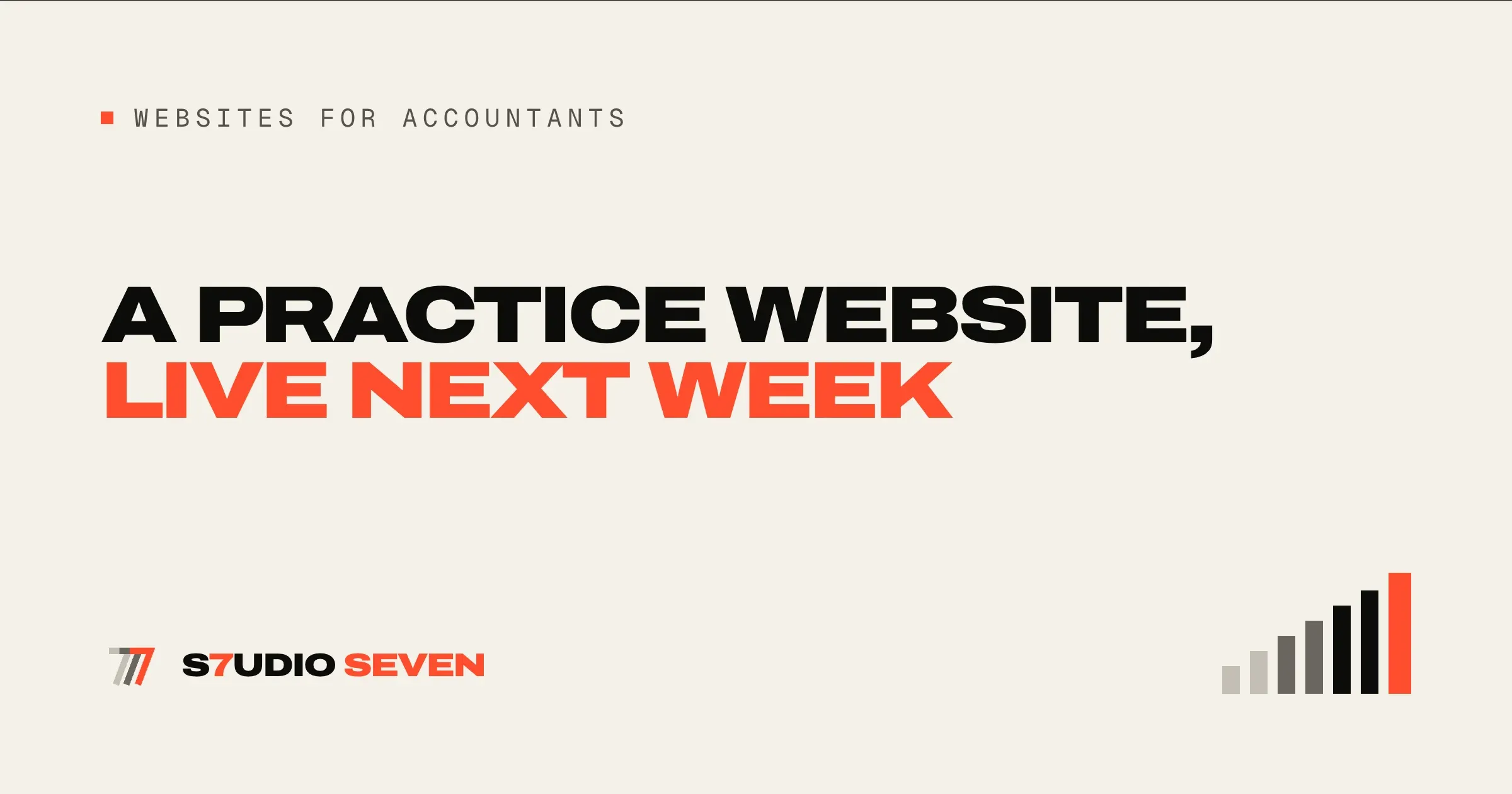
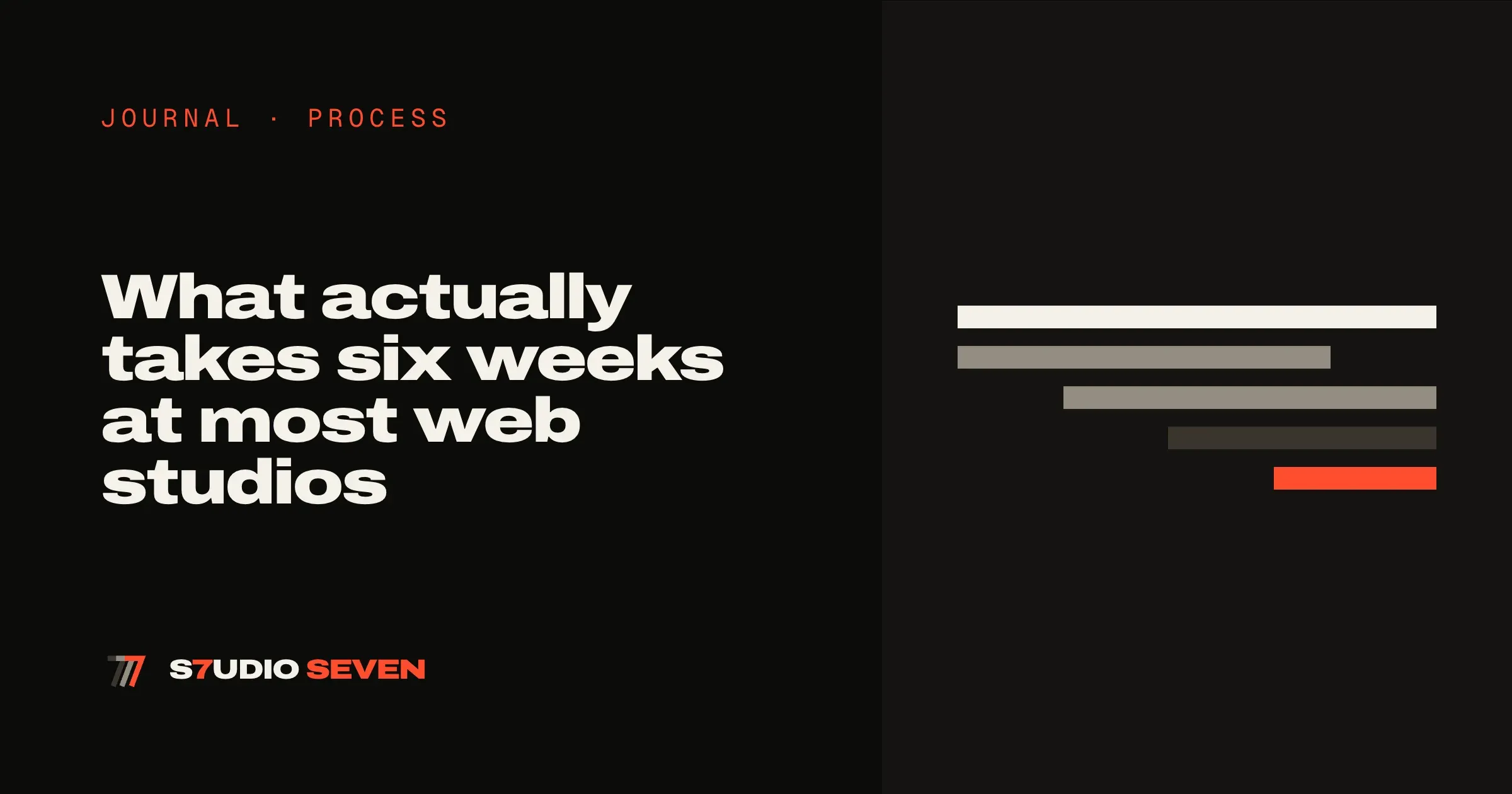
Share cards. When someone posts a link to your site, the preview card is often the first thing anyone sees of you. We set one grid for all of them, with the headline in the display type and one orange phrase, and made a version for every kind of page, so each page shares with its own card.
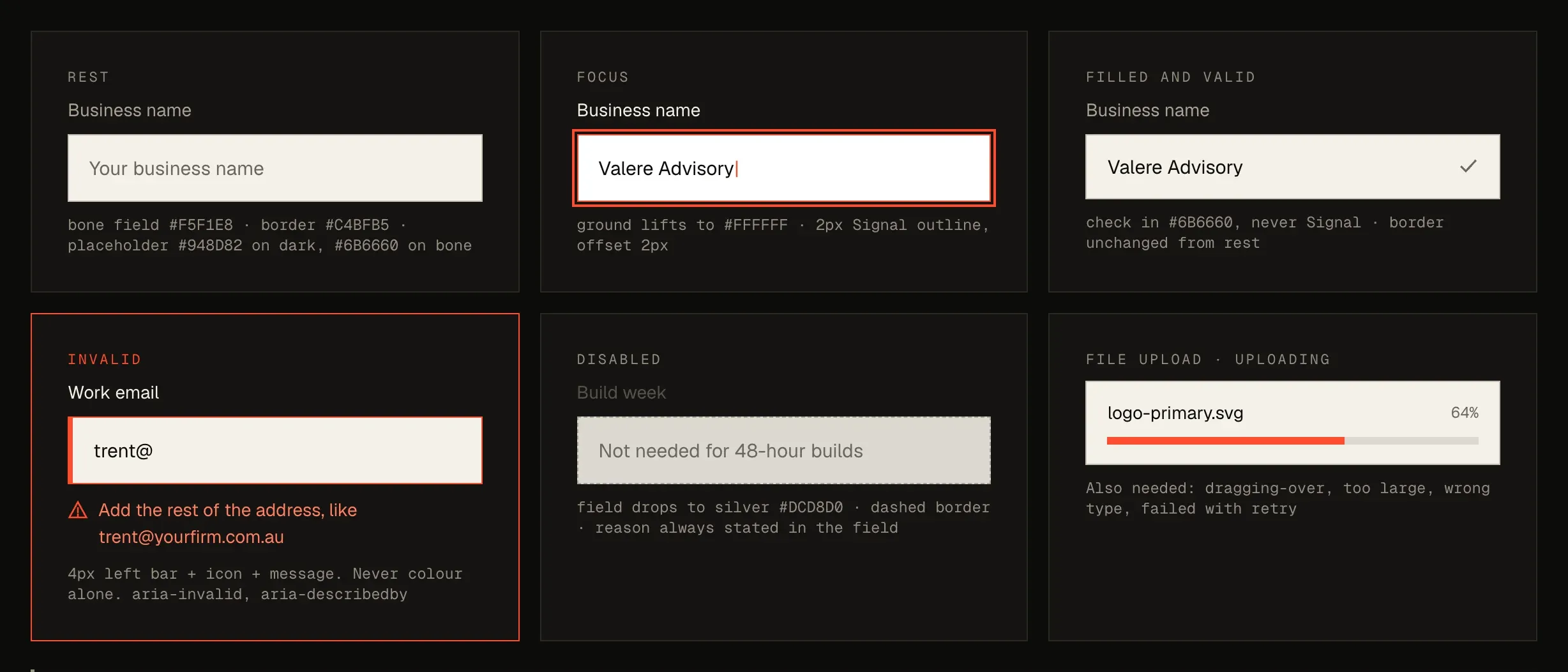
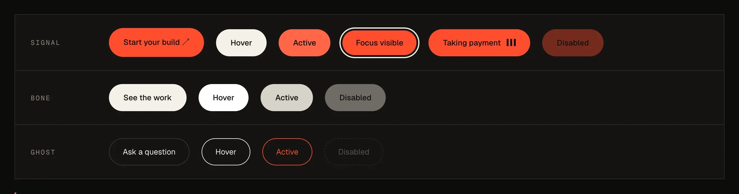
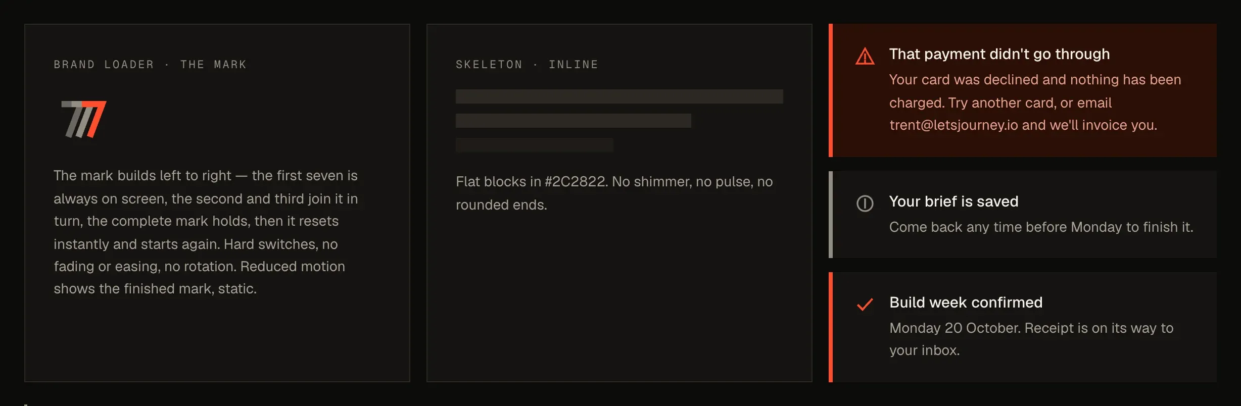
Every state, not just the happy one. A form field at rest, focused, filled, wrong and disabled. A button hovered, pressed, focused, sending and switched off. A loader, a skeleton and an alert for each outcome. These are the moments that make a site feel finished or not, and they’re usually left to whoever builds it on the day.
If you don’t have a brand yet, we make one. Everything in this chapter is what we do for our own brand, and it’s what we can do for yours. If you’re starting from nothing, we’ll create your brand from scratch before your build week: the mark and its versions, colours, type, share cards and the full set of states, written up in a specification like this one. It’s a fixed $2,990 AUD (£1,650 or US$2,150), and your site then launches wearing it. Add it when you start your build.
The design
One idea per screen, and room to breathe.
We borrowed from four sites we admire and made the ideas our own. From Cloudflare, big panels of colour and rows of work that move as you scroll. From Ricola, the confidence to be playful with colour. From Bejamas, precision in the details. From Namesake, closing on a giant wordmark.
Human-centred spacing. On a laptop, every section fills at least one screen, with its content centred, so the end of one idea and the start of the next never share the view. The reader isn’t asked to process two things at once. We don’t snap the scrolling, though, because the reader stays in control.
Built for the phone first. Most people will first see a service business’s site on their phone. On a small screen every long paragraph goes flush left, because the brand never centres more than two lines of text.
The page order is the reader’s order. What is this, and can I see it? Why is it different? What do I have to do? What do I get? Is it really fast? What does it cost? What happens afterwards? What if it goes wrong? What else might I ask? Each question became one section of the homepage, in that order.
The copy
Written before the design, to one reader.
We write every word before we design anything, for clients and for ourselves, because design built around placeholder text always has to be redone once the real words arrive.
One person, one conversation. The copy talks to a single reader in full sentences, the way you’d explain it across a table. We avoid the habits that make agency sites sound the same: two-fragment headlines, lines like “No X. No Y.”, and a punchy closer at the end of every paragraph.
Short headlines, long leads. Big display type only works when the headline is short, so the headline makes one point and the paragraph underneath does the explaining.
Facts stated as facts. Prices are on the page. The guarantee is in plain English. The next open build week is a real date, and a week only says it’s full when it is. We never show made-up scarcity.
The build
Fast because there’s nothing extra.
Astro, static pages, plain CSS. Every page is built ahead of time into plain HTML, so it arrives ready to read instead of being assembled in the browser. The styles are plain CSS with design tokens for colour, space and type. The only server code is for the parts that need it: booking and payment, the brief, file uploads, the live speed test and the AI site reader.
Images that earn their weight. Every image is resized and compressed for the screen it lands on. The live client sites on the work page are real screenshots with short scroll-through videos, and a video only loads when someone hovers over it.
Analytics that waits its turn. Analytics loads on your first scroll, tap or key press, not on the first paint. Loading it straight away cost the homepage about 20 points on the speed test. It also runs without cookies.
Accessible by default. Headings in order, real buttons and links, visible focus, labels on every field, colour contrast checked on every ground, and every effect you’re about to read about has a still version for anyone whose device asks for reduced motion.
The same emails and states as any client site. Branded confirmation emails, a progress panel for long waits, error messages that say what to do next, and a 404 page that points somewhere useful.
Motion and magic moments
Every animation has a job.
We gave ourselves three rules for motion. It has to explain something or reward curiosity, never just decorate. It only runs while something is actually moving or on screen, so it costs nothing when you’re not looking. And under reduced motion it stops, and you get the finished state. All of it together is under 10 KB of JavaScript, with no animation library.
Here is every effect on the homepage, in the order you meet it. Five of them are running live on this page, so you can try them.
The dot grid and the Trail seven cursor
Homepage hero →Move your pointer across the panel
- What you see
- A grid of small ink squares on the orange panel. Near your pointer they grow and push aside, then spring home, so a wave follows you across the panel. Your cursor becomes the Trail seven, with its two ghosts trailing behind.
- Why it’s there
- It’s the first thing you touch, and it answers to you straight away. A site that reacts that quickly says the thing we’re selling without a word.
- How it’s built
- A canvas of a few hundred squares on springs. It only animates while your pointer is moving and stops when everything settles. The cursor is three SVG sevens following at three different speeds.
- Reduced motion
- The squares stay still and the normal cursor stays. It’s also off on touch screens.
Client sites that slide as you scroll
Homepage, recent work- What you see
- Two rows of real client sites move sideways as you scroll down the page, in opposite directions.
- Why it’s there
- Proof comes before any promise. The movement tells you there’s more than fits on the screen, without an autoplaying carousel.
- How it’s built
- Each row’s position is tied to how far the section has scrolled. There’s no loop and no timer, so it only moves when you do.
- Reduced motion
- The rows become normal scrollable strips.
The story that turns orange
Homepage, “You’ve probably been here before”- What you see
- The heading stays pinned while five short statements pass by: three weeks in and still in briefings, eight weeks in with a design that has no words, four months in and still not live, or a template over a weekend. Each has a line illustration that draws itself as it arrives. The last one, seven days, turns the whole section orange.
- Why it’s there
- It tells the story every owner already knows, then changes the ending. The colour change is the turning point.
- How it’s built
- A pinned column and scroll position. The illustrations are hand-drawn SVGs whose strokes draw on with CSS.
- Reduced motion
- Every statement and illustration shows at once.
The wave ticker
Homepage, “Here’s how your week works”- What you see
- The seven days, 01 Direction to 07 Live, run along a curved line as you scroll.
- Why it’s there
- It turns a list of seven steps into one continuous week you can feel moving.
- How it’s built
- Text set on an SVG path, with its position along the path tied to scroll. We measure the text and the path so it enters and leaves cleanly at any screen width.
- Reduced motion
- The text sits still on the curve.
The squares that change colour
Homepage, “Everything you need is already included”- Custom design
- Copy written for you
- On-page SEO
- Redirects
- Enquiry forms
- Speed 95+
- Mobile-first
- Analytics
- What you see
- Each square fills with a brand colour when you hover over it. The colour is random, and never the same one twice in a row.
- Why it’s there
- A grid of features can read like a checklist. A little play keeps people reading to the end.
- How it’s built
- A few lines that pick bone, silver or signal on hover. The same idea colours the rows of the journal and the industry list.
- Reduced motion
- The colour change stays, because it’s a colour change, not movement.
Speed gauges and the live speed test
Homepage, “Your site will be as fast as this one”- What you see
- Four gauges fill to our own Lighthouse scores. Underneath, you can type in your own website address and Google tests it while you watch, with a progress panel that ticks off each step.
- Why it’s there
- It turns a claim into something you can check, and puts your site right next to ours.
- How it’s built
- Google’s PageSpeed service does the test. The progress panel is paced on the usual wait, never passes 95 per cent until the answer is back, then runs to 100 before your scores appear.
- Reduced motion
- The gauges show their final scores and the bar fills without its stripes.
Sevens that drift and collide
Homepage and pricing, the Care sections- What you see
- Trail sevens drift behind the section and bounce off each other and the edges. When two knock together they flash orange for a moment, with a small spark where they touched. They fade almost to nothing as they pass behind the words.
- Why it’s there
- Care is the part that keeps going after launch, so it’s the one section that’s always gently moving.
- How it’s built
- A small physics loop: each seven is a circle with a mass, and a collision swaps momentum along the line between them. It pauses whenever the section is off screen.
- Reduced motion
- The sevens are drawn once and stay put.
Lightning, twice
Homepage and guarantee page →On time, or your money back.
- What you see
- The first time the guarantee scrolls into view, two orange bolts strike, one down each side, and the section flashes faintly where they land.
- Why it’s there
- The guarantee is the boldest thing we say, so it gets the boldest moment. It only happens once, so it never becomes wallpaper.
- How it’s built
- Each bolt is a jagged path drawn in about a tenth of a second, in the same angular language as the seven, with a soft glow and a flash behind it.
- Reduced motion
- No lightning, just the guarantee.
Questions that open into cards
Homepage and FAQ →- What you see
- The answer you open becomes an ink card with an orange edge, and eases open instead of snapping.
- Why it’s there
- It keeps your place clear on a long list of questions.
- How it’s built
- Native HTML disclosure elements, so they work without JavaScript, with a CSS transition where the browser supports it.
- Reduced motion
- Answers open instantly.
The wordmark where every letter reacts
Bottom of every page- What you see
- S7UDIO SEVEN spans the full width of the closing band. Hover over any letter, or tap it on a phone, and each one does something different: one turns bone, the 7 grows its Trail ghosts, the U takes a lightning strike, one rolls, one jumps, one flips upside down.
- Why it’s there
- It’s the last thing you see, and it rewards anyone who got this far with something to play with.
- How it’s built
- The word is laid out once so it spans the width exactly, then each letter is split out at its measured position with its own short effect. Nothing loops.
- Reduced motion
- Only the colour, outline and stripe changes remain.
You can try the last one now: it’s at the bottom of this page.
Results
What 48 hours produced, and what came after.
Measured on a phone, against the live site. The homepage scores 98 for performance and 100 for accessibility, best practice and SEO on Google’s Lighthouse test. Inner pages score 97 to 99 for performance.
Everything a client gets. Branded emails for every step of the week, a brief that can read your current site and draft your answers, uploads straight into your build folder, and payments handled by Stripe.
Then we kept going. Since launch we’ve kept refining it, adding the effects above one at a time and checking the speed score as we went. That’s exactly what Care is for: your site keeps getting better after it goes live, and you never have to touch it yourself.
Every build runs the same way this one did. Pick your package and your week starts on the next open Monday.