The starting point
An award-winning product that the website only described.
AccountKit is practice software for accounting firms. It brings workflow, document management and compliance tools together, and connects them to the software a firm already uses, like Xero Practice Manager, SharePoint, Dropbox and the e-signing apps. It was named FY25 NZ Xero Practice App of the Year, and firms like Nexia, BDO and Grant Thornton run on it.
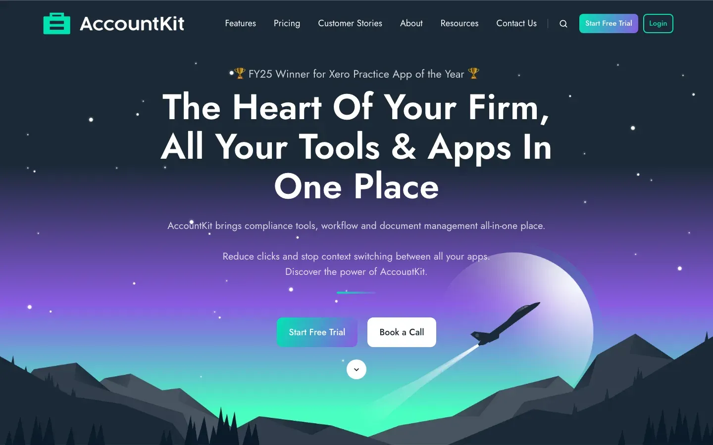
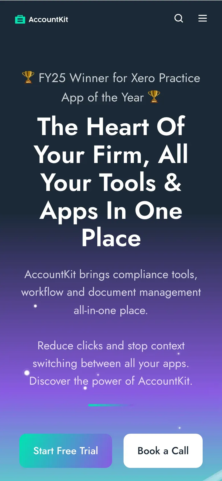
The old website told you all of that in words. The first screen was a rocket over purple mountains, with a centred headline in title case and two paragraphs about reducing clicks. You had to take the “all in one place” promise on trust, because nothing on the page showed it.
It also ran on HubSpot’s CMS, at $12,000 a year. The team was paying for a content platform they only used to publish the odd post. It wasn’t adding anything a modern static site can’t do better, and every page was harder to change than it needed to be.
Before
After
The idea
Put the whole practice in the first screen.
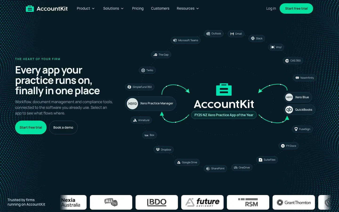
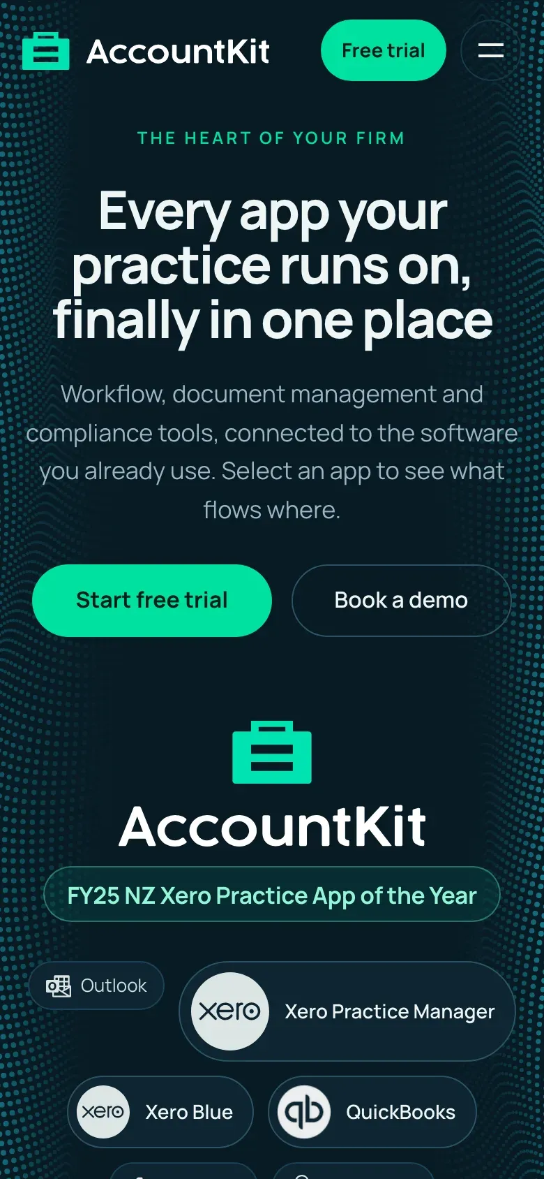
The strongest thing about AccountKit is that it sits in the middle of everything. So the new hero is a map of exactly that: AccountKit in the centre, with every app a practice runs on arranged around it.
Select any app and it shows you what flows where. Data comes in from Xero Practice Manager on the left and goes out to Xero Blue and QuickBooks on the right, and the arrows show which way it moves. Colour does the explaining: mint is AccountKit, violet is your other apps, and cyan means data coming in.
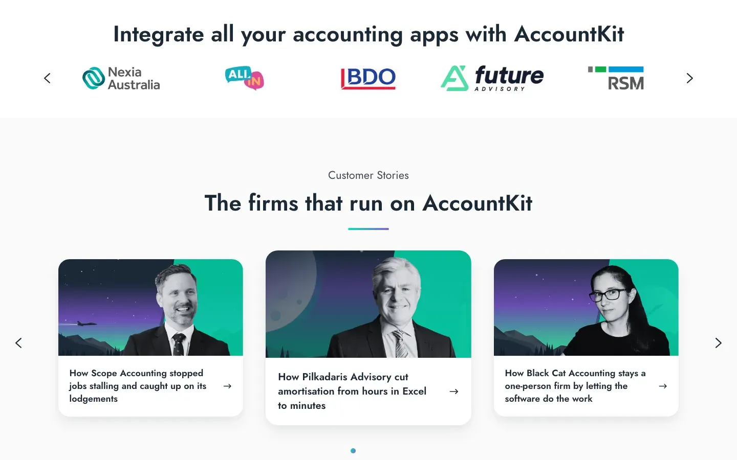
The proof sits right underneath. The award is on the map itself, and the logos of the firms that use AccountKit run along the bottom of the first screen, so an accountant sees who else trusts it before they scroll.
Before
After
The pages
Show the product working, on every page, not just the homepage.
The first version we reviewed had a strong homepage and inner pages that fell back to generic icon cards. We scored every page against our quality bar, and the inner pages came in well below the homepage, so we rebuilt them to share its language.
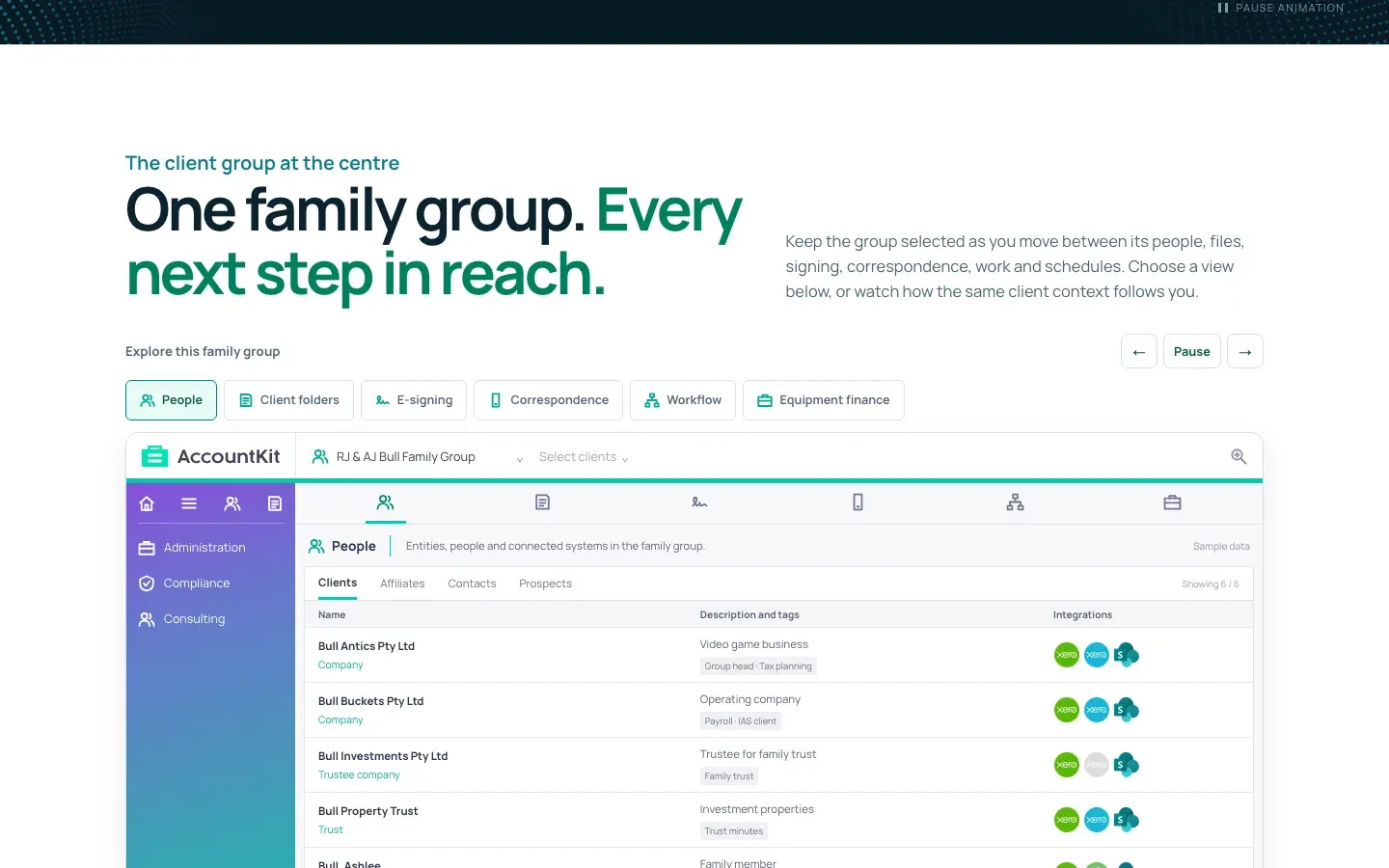
The product walkthrough uses real screens. One family group sits in the middle, and you can move between its people, folders, e-signing, correspondence, workflow and equipment finance without losing your place. The sample data is labelled as sample data.
Every tool and integration has its own page. There are 17 tool pages, from the Division 7A calculator to the correspondence register, each with a working demo on sample data. There are 19 integration pages too, one for each app in the ring, so a firm searching for “AccountKit and SharePoint” lands on an answer.
Firms can find the setup that fits their size. There are five pages for bookkeepers, small firms, growing practices, established firms and larger firms, each with where firms that size get stuck, a starting setup, a customer story and a suggested plan.
Before
After
The move
All 74 old addresses, accounted for one by one.
Leaving HubSpot’s CMS was half the job, and the half where websites usually lose their search rankings. So before cutover we listed every URL in the old sitemap and decided what happens to each one.
62 pages answer at the same address. That includes the homepage, pricing, security, the legal pages and all 45 blog posts, which moved across word for word with their images.
12 get a permanent redirect. Features became /product, the Xero page moved under integrations, and six case studies moved to a new customer stories section.
The CMS bill goes, and $12,000 a year goes with it. AccountKit didn’t need a content platform. They needed a fast site they own, and a simple way to publish a post, which Care now covers.
HubSpot keeps doing what it’s good at. The sales team still uses HubSpot for its CRM, so the demo form posts straight into their existing HubSpot form, the booking calendar is their HubSpot meetings page, and the tracking keeps its history. These scripts wait until someone interacts with the page, so they don’t slow the first screen down.
The client owns the hosting. The site runs on Cloudflare Pages in AccountKit’s own account. We checked 92 URLs against the live deployment after the move, including every redirect.
Results
Faster, clearer, and owned by the client.
Measured on a phone. The homepage scores 97 for performance and 100 for SEO on Google’s Lighthouse test, and the product, pricing and customer story pages score between 97 and 99.
The pages got shorter where it matters. We measured every page before and after: About is a third shorter, and Contact and Webinars are about a quarter shorter. Pricing grew, because it now has a plan finder and a comparison table, and we told the team exactly which block to move if they want it shorter.
It costs less to run. Dropping HubSpot’s CMS saves AccountKit $12,000 a year, and the site is faster and easier to change than it was on the platform they were paying for.
The team can change it themselves, with AI. The whole site is plain files in AccountKit’s own repository, so the team can ask an AI assistant to change a price, reword a paragraph or update a blog article, and see it live a few minutes later. There’s no CMS to learn and no ticket to raise for a small change.
And they still have a studio behind them. When they need something bigger, like a new section, a view on what to do next or help with search, they come to us through Care, and we pick it up from the same files.
If your website tells people what your product does instead of showing them, see how a build works or pick your package.