The starting point
A good product on a website that made it look harder than it is.
Easy Business is an app that small business owners use to send invoices, pay their team, match their bank feed and see their BAS numbers, all from their phone. It’s genuinely easy to use, and the reviews say so: it rates 4.8 on Trustpilot.
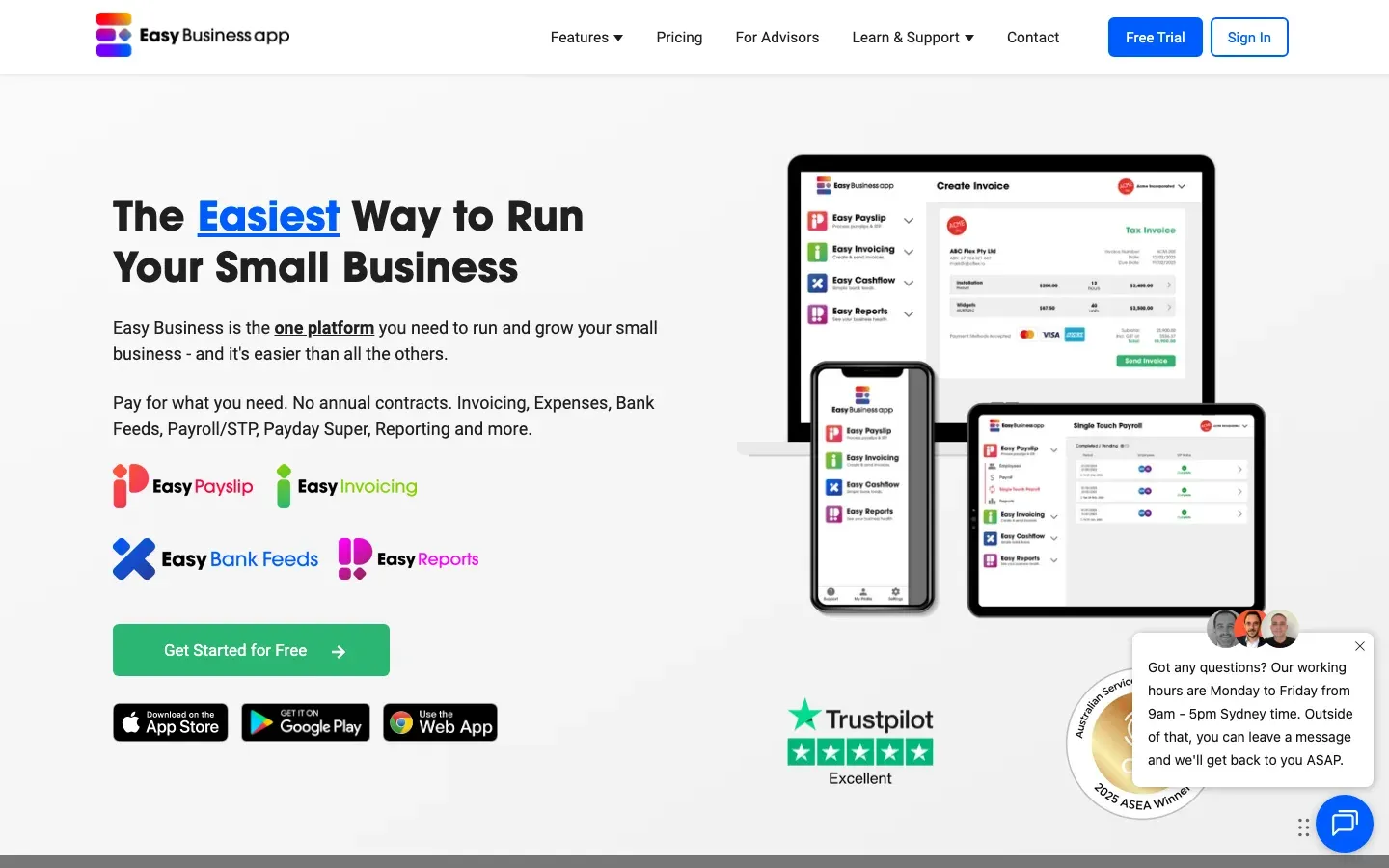
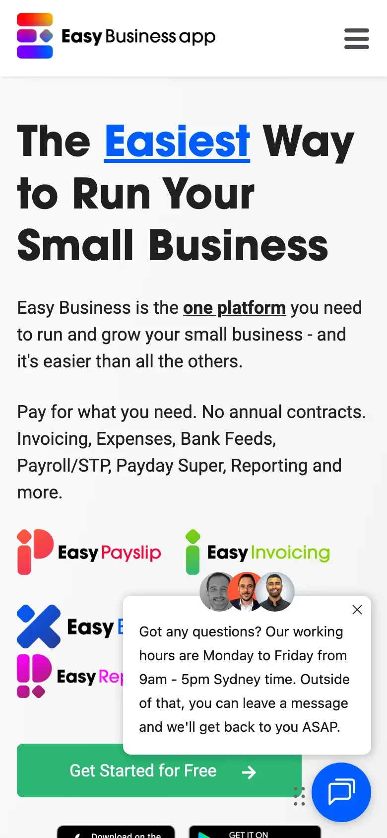
The old website didn’t feel that way. The first screen had four product logos, three app store badges, a device mockup, an award badge and a chat window that opened over the top of the call to action. On a phone, that chat window covered half the product names before you’d read a word.
The site also lived in three places. The marketing pages were on HubSpot, the blog was on its own subdomain, and the landing pages were on another one. Adding a page meant working in HubSpot’s editor, and every change looked slightly different from the last. Like a lot of software companies, they were paying for a CMS they didn’t really need.
Before
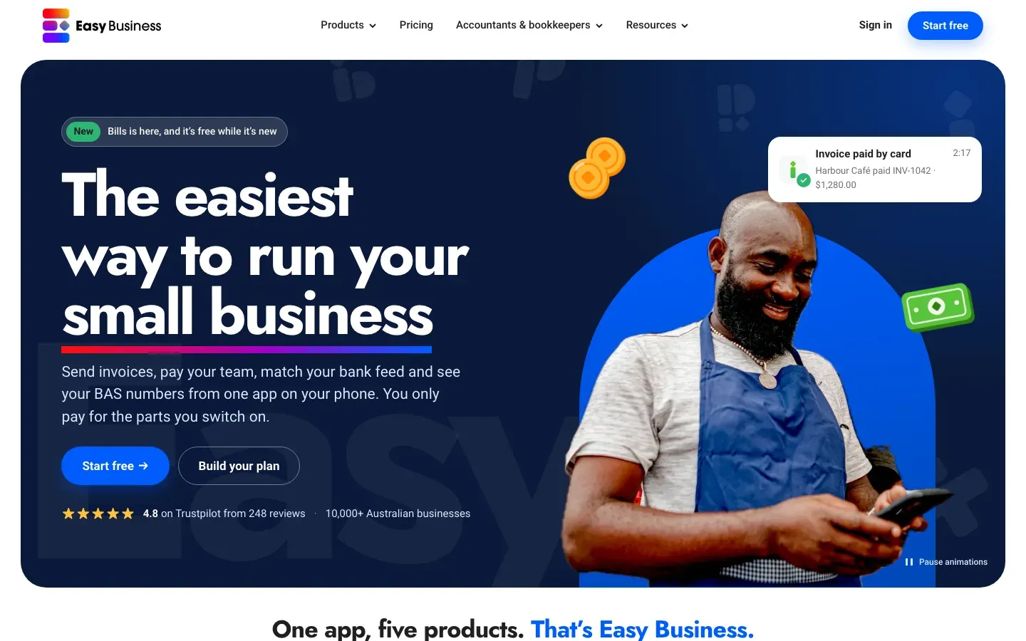
After
The decision
We designed a new brand, and the client chose to keep theirs.
We started by showing what Easy Business could look like with a fresh identity, alongside the same pages in the brand they already had. We built six homepage versions, three layouts in each of the two brands, so the team could compare them on real screens rather than in a slide deck.
In the review meeting the team picked the brand they already had, and a homepage made from the best parts of three of the layouts: the product tiles from one, the testimonial strip and the jobs-to-be-done story from another, and the hero and comparison table from the third.
That was the right call for them. Their customers already know those product colours and symbols, and a website launch is a bad moment to also ask 10,000 businesses to learn a new logo. The new-brand work is still there for the team whenever they’re ready for it.
The name got simpler at the same time. Easy Business App became Easy Business, and the products dropped “Easy” from their names, so Easy Payslip became Payroll. Bills arrived as the fifth product during the build.
The design
The same brand, with room to breathe and a person on every page.
We kept the logo, the product symbols and the blue, and changed almost everything around them.
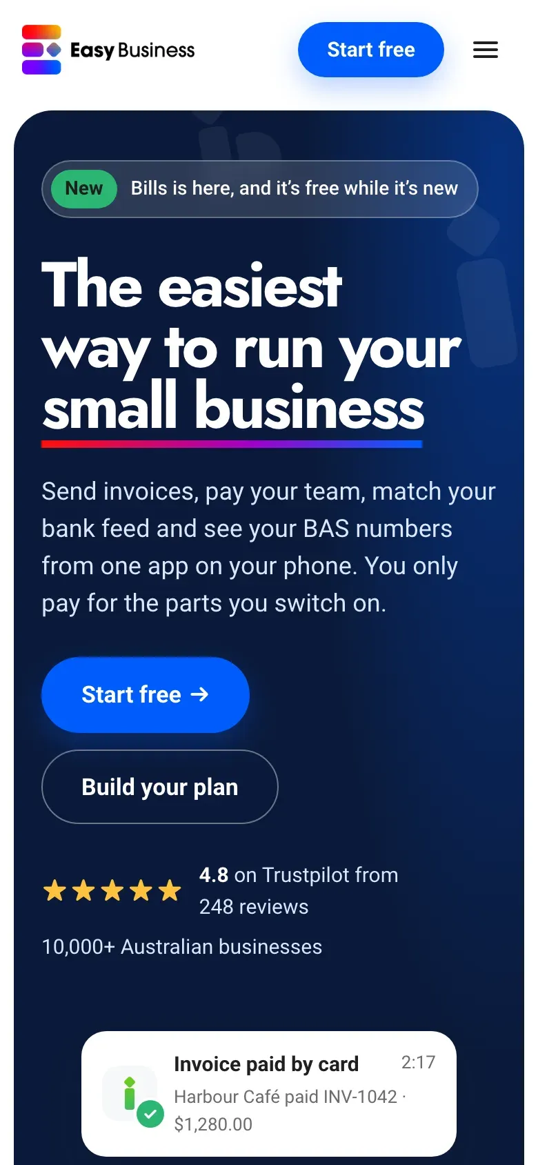
The hero shows the outcome, not the software. Instead of a laptop, tablet and phone all showing the same app, the first screen is a small business owner on their phone, and the thing they care about arriving: an invoice paid by card. The big faded “Easy” sits behind it, which the team liked from the first round.
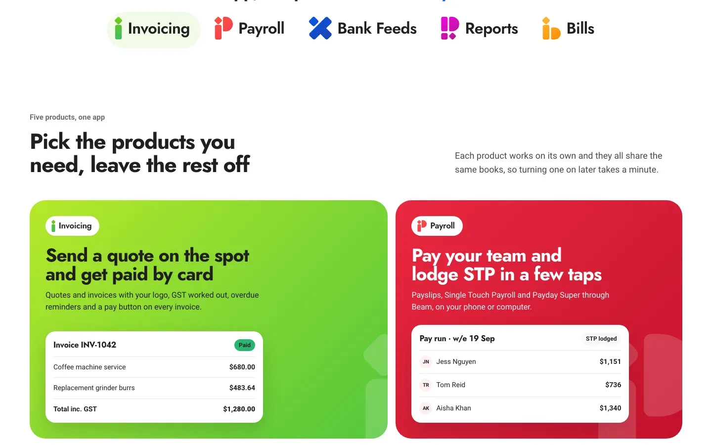
Every product gets its own colour and its own moment. The five products sit in a row of tiles, each in its product colour, each with a small piece of the real interface: a paid invoice, a pay run with Single Touch Payroll lodged, a matched bank line.
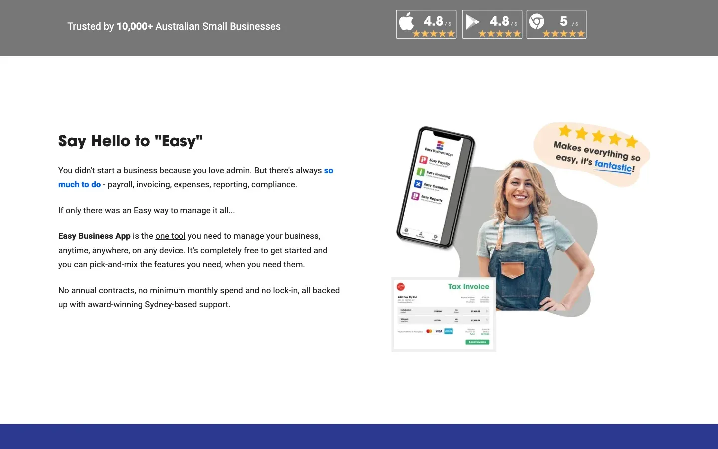
Proof sits where you decide. The Trustpilot rating and the 10,000 businesses line sit right under the buttons, instead of in a grey band further down the page.
Before
After
Before
After
The system
A small set of pieces, so a new page is just an arrangement.
The team asked for one thing above all: when they need a new page, they want to put it together from pieces that already exist, not start again.
So the whole site runs on a short list of components. There’s a header with a mega menu, two kinds of hero, product tiles, a figures row where every number has a source, a testimonial strip with a pause button, a jobs-to-be-done story that pins as you scroll, a plan builder, a comparison table that stacks on a phone, a form, and two closing panels.
One product template does all five products. Invoicing, Payroll, Bank Feeds, Reports and Bills each fill in the same template with their own copy, colour and screens. The accountant and bookkeeper pages share one template too.
Blog posts are just files. Posts and case studies are Markdown files in the team’s own repository, and they edit them in VS Code. There’s no CMS to log into and nothing to pay for monthly, and because it’s all plain files, the team can ask an AI assistant to make a change for them.
The move
Every page moved across at the address it already had.
Moving off HubSpot is where sites usually lose their search rankings, so we audited the live site before building anything. That meant the sitemap, a crawl of every page, the navigation, every subdomain, the forms, the tracking and the prices.
The addresses stay the same. Almost every page kept its URL, so there was very little to redirect. Where something did move, like the blog coming in from its own subdomain to /blog, one of 30 redirects sends people and search engines to the new place.
All 66 blog posts came across. Each one has its tags, its date and a share image, and there’s an RSS feed at the same address. We marked the posts whose information has gone out of date, so the team can refresh them first.
The site grew where it helps people choose. There are now 14 comparison pages against the apps people switch from, four pages on alternatives, pages for accountants and bookkeepers, and three customer stories. In all, 168 pages build from the new system, and we checked 156 of them on a phone and a laptop before handing it over.
What’s next
Launch, then keep it getting better.
The new site is on its preview address while the team reviews it, and it goes live on easybusinessapp.com once they sign off. The redirects and share images are ready to go on the day, and that’s also the day they stop paying for HubSpot’s CMS. HubSpot stays for what it’s good at, and the website no longer depends on it.
The team runs it day to day, with AI. After launch, they can ask an AI assistant to update a price, write up a new blog article or add a page from the pieces that already exist, and it builds and goes live on its own. Small changes take minutes, not a request to an agency.
We’re there for the bigger things. When they want a new section, a second opinion on what to change or help with search, they come to us through Care. That’s the point of building it this way: the site should get better every month without anyone having to start again.
If your website makes a simple product look complicated, see how a build works or pick your package.